What or Why in Machine Learning
A comprehensive guide to interpreting models using Python
Machine learning using big data is all the rage in business. These phrases are giving “synergistic office speak” a run for their money. Behind these buzzwords, the development of machine learning techniques and the machines that implement them in the past decade has been truly remarkable. The increasing complexity of models has allowed for machines to better classify, label, and predict continuous values. However, as the models become more complex, how can we be sure the models are not utilizing training biases or predicting on subtle changes to the background noise. Machines make errors differently than humans. (See examples here, here, and here) Using the python libraries ELI5, PDPbox, Lime, and SHAP, we can visualize how a model predicts an outcome, weights the importance of features, or distinguishes boundaries in an image. Without further ado, let’s peek behind the curtain of the black box model to see how our models perform. The code and images are found on GitHub.
**Click here for help setting up the environment**
When training a classification model, we are attempting to minimize the misclassifications of a separate testing set. Using the Wisconsin Breast Cancer Dataset, we attempt to classify if a tumor is malignant or benign based on tumor features. To train our model we will use a Random Forest and split the data 85/15. Predicting on our testing set we receive the following confusion matrix:
](https://cdn-images-1.medium.com/max/2480/1*x5nnDuOofpbL4kGrfOaH5w.png)
Error Analysis
Exploring the errors in the model is a good method to understand if certain features are driving the model predictions. We developed a method to output the indices of false positives (FP) and false negatives (FN) observations in the testing set. We explore the contributions of features to an error (FP in this article) using ELI5.
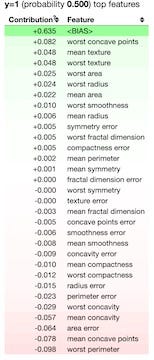
We could also explore this tricky case with Lime.
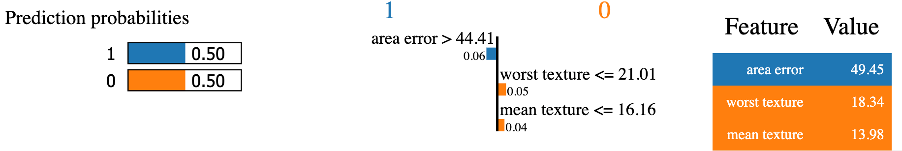
or SHAP.
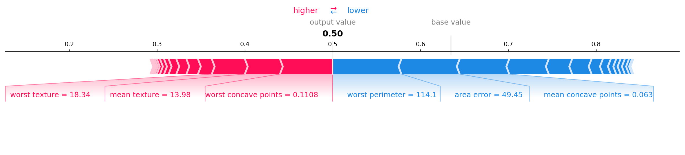
The images above all explore the contribution of the full feature set on a single test case. SHAP, ELI5, and additionally PDPbox can explain the most important features across all the testing data. This can be useful for reducing the number number of features and deriving knowledge for future data collection protocols.
Feature Selection
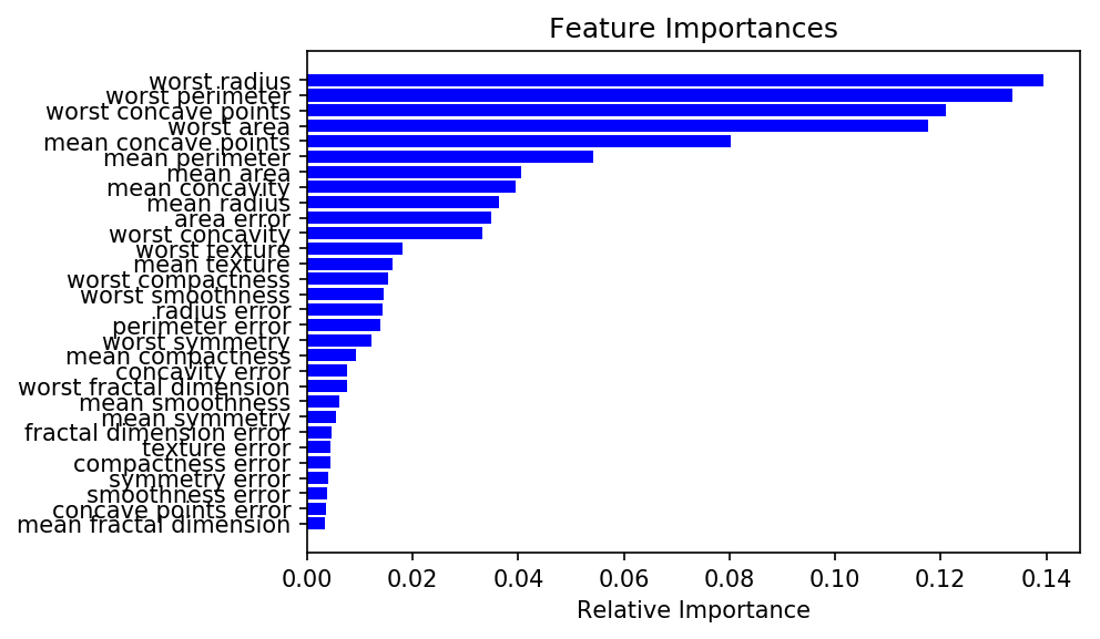
Since we are using a random forest model, we can collect the feature importances directly from sklearn.
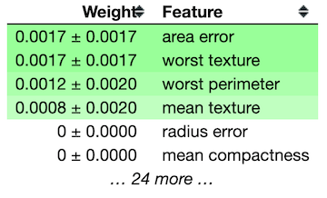
ELI5’s permutation importance function measures the decrease in accuracy when a feature is removed. This removal is accomplished by shuffling the values of a feature thus creating noise.
My personal favorite for exploring feature importances is SHAP. The summary plot is displayed below.
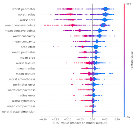
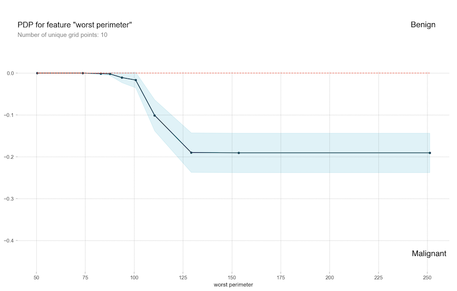
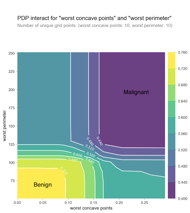
We can see the values of worst radius and worst perimeter are very important features. They essentially measure the size of the tumor. The worst concave points is another feature that carries a lot of weight and is different than the prior two. How do the worst concave points and worst perimeter correlate? We can use PDP to explore feature independently:
Or we can explore them together:
SHAP can also perform a similar analysis to PDP colored by SHAP values.

Additionally, we can also perform feature selection using sklearn.
Image Analysis
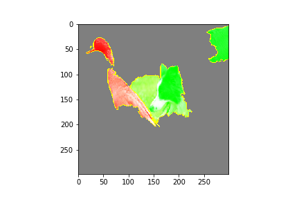
For this section, we are using deep learning for image recognition. Traditionally thought of as a black box, we are using Lime to mask important features in image classification. I am using a pre-built Neural Network from Marcotcr. The network favors dog classification and has some depreciated methods. Feel free to choose your own image classification network. Given the image of a goose and a border collie the performance of the model is as follows:
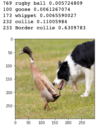
Our model correctly identifies the border collie and the goose. A collie and whippet are similar types of dogs. Let’s see how the network makes these identifications.
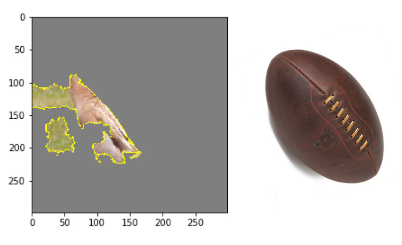
In addition to correctly calling a goose and various dogs, our algorithm thinks there is a rugby ball in this image. I wonder why?
There you have it! A walk through of feature contributions to outliers, feature importance visualizations, and image recognition features in python. Give this article a clap, follow me, and be sure to check out my personal LinkedIn. All the code and data for this article can be found on Github. Using these tools to explain the model will allow you to detect biases, debug, direct future data collection, and build trust with more transparency.


Comments
Post a Comment